Reminder - if you're interested in applying for our design team there are just a few days left! You can find the details in our side-bar here on the blog.
Now before I announce the winners - let me take a minute and thank Simon Says Stamp for another chance to win a $50 voucher!! Simon is supporting some great things for our blog - can't wait to share more!
Now before I announce the winners - let me take a minute and thank Simon Says Stamp for another chance to win a $50 voucher!! Simon is supporting some great things for our blog - can't wait to share more!

Last week's challenge was all about ink - and as always the entries were fantastic. The lucky (randomly drawn) winner for the favorite ink challenge is...
Please claim your prize within the next two weeks by emailing May.
Now let's talk about the top 3 projects as chosen by the Stamp & Show design team. Everyone had so much great inspiration to share, and so many different favorite inks! One thing is for sure - there is no wrong answer to the question "what is your favorite ink?" This week the honors go to three incredible projects, all such different takes on the challenge this week:
9 Susan W
68 BarbaraYaYa
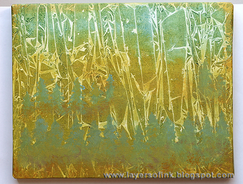
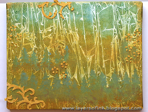
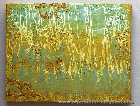
74 Meihsia Liu
Be sure to visit their blogs and check out their amazing entries. So inspiring! Congratulations to each of you on a challenge well done! Please email May for the Top 3 Blinkie.
I'd like to thank everyone who took part in the challenge. It is always a joy to see what you create. I'd also like to say thank you again to Simon Says Stamp for their generosity - each week we give away a $50 gift voucher to the shop that you can use to buy all kinds of fabulous stamps, inks, and paper crafting supplies.
Remember - you just need to enter the challenge each week to be entered into the drawing!
Remember - you just need to enter the challenge each week to be entered into the drawing!